A New Standard
American Standard
Before American Standard Barbershop ever opened its doors, it needed more than a logo, it needed a point of view.
The Challenge
The goal was to build a barbershop brand that felt elevated without losing its grit. Something rooted in heritage, but not stuck in nostalgia. It had to signal quality, masculinity, and craftsmanship while still feeling modern enough to grow beyond the four walls of a shop. This was never meant to be just another neighborhood barbershop. It was meant to set a new standard.
The Approach
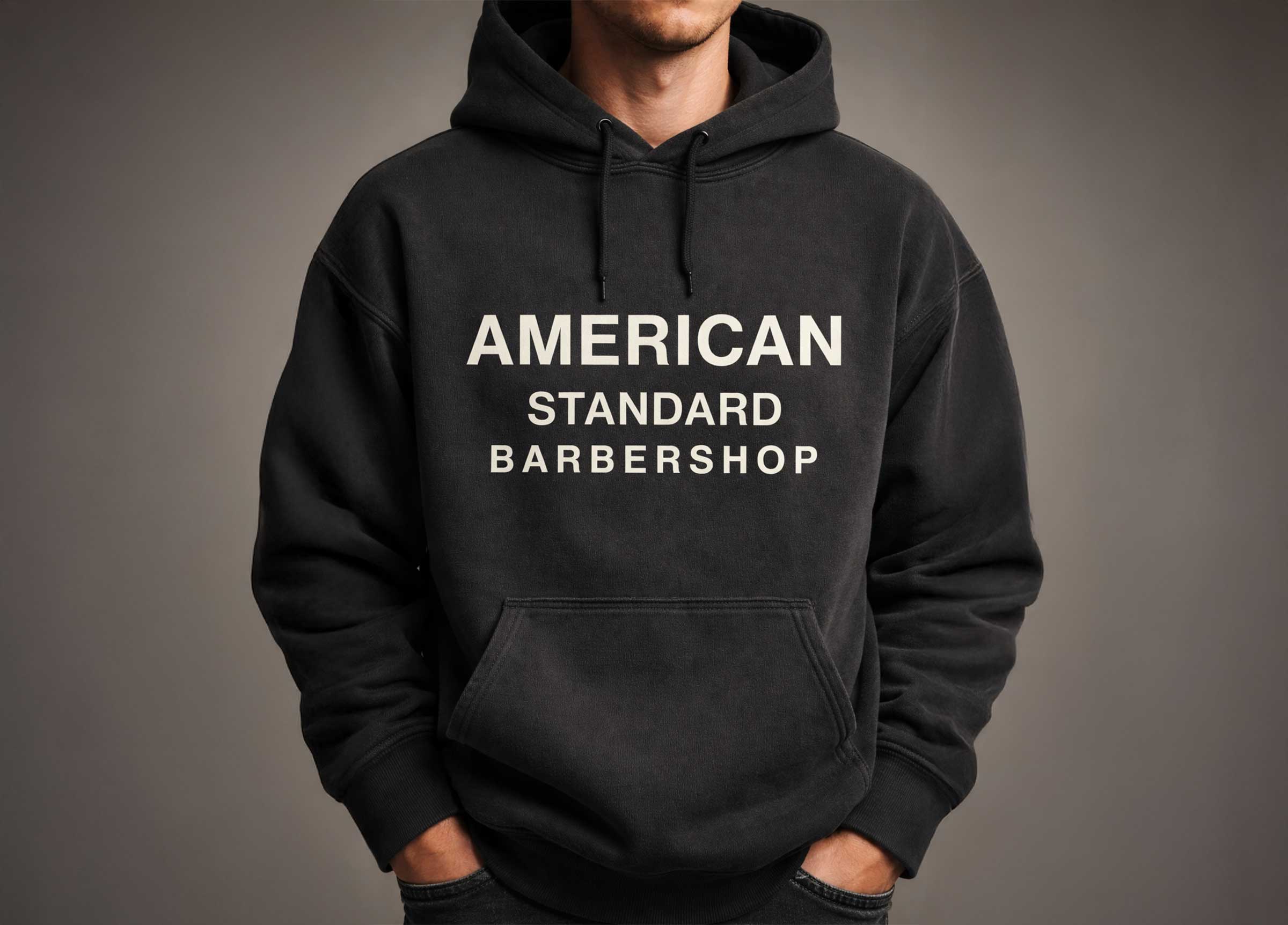
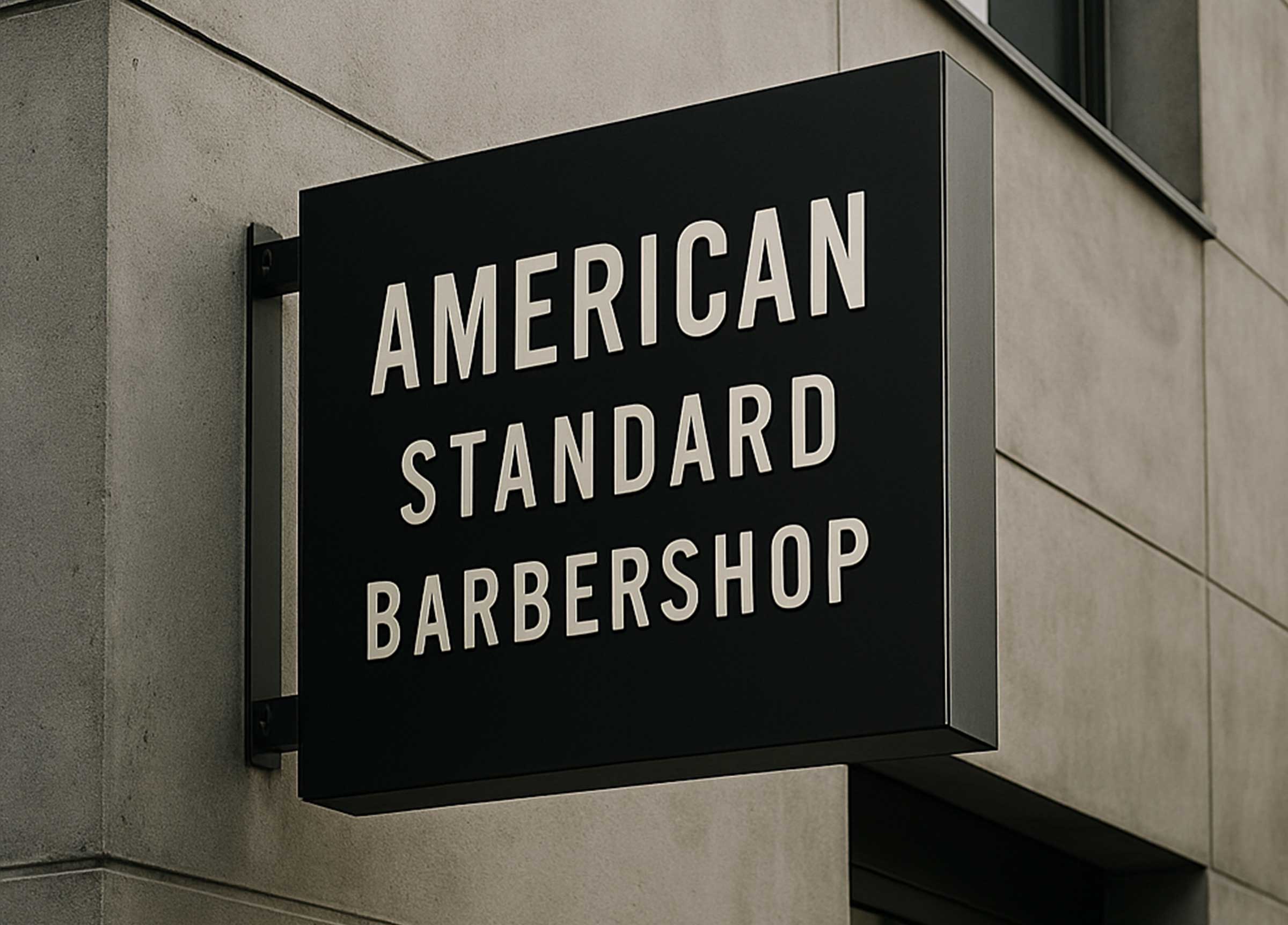
We anchored the brand in simplicity and modern revival. Drawing inspiration from classic American trade signage and Gothic typography, we explored letterforms that felt historic yet refined. The modern Gothic type became the backbone of the identity, strong, structured, unmistakable.
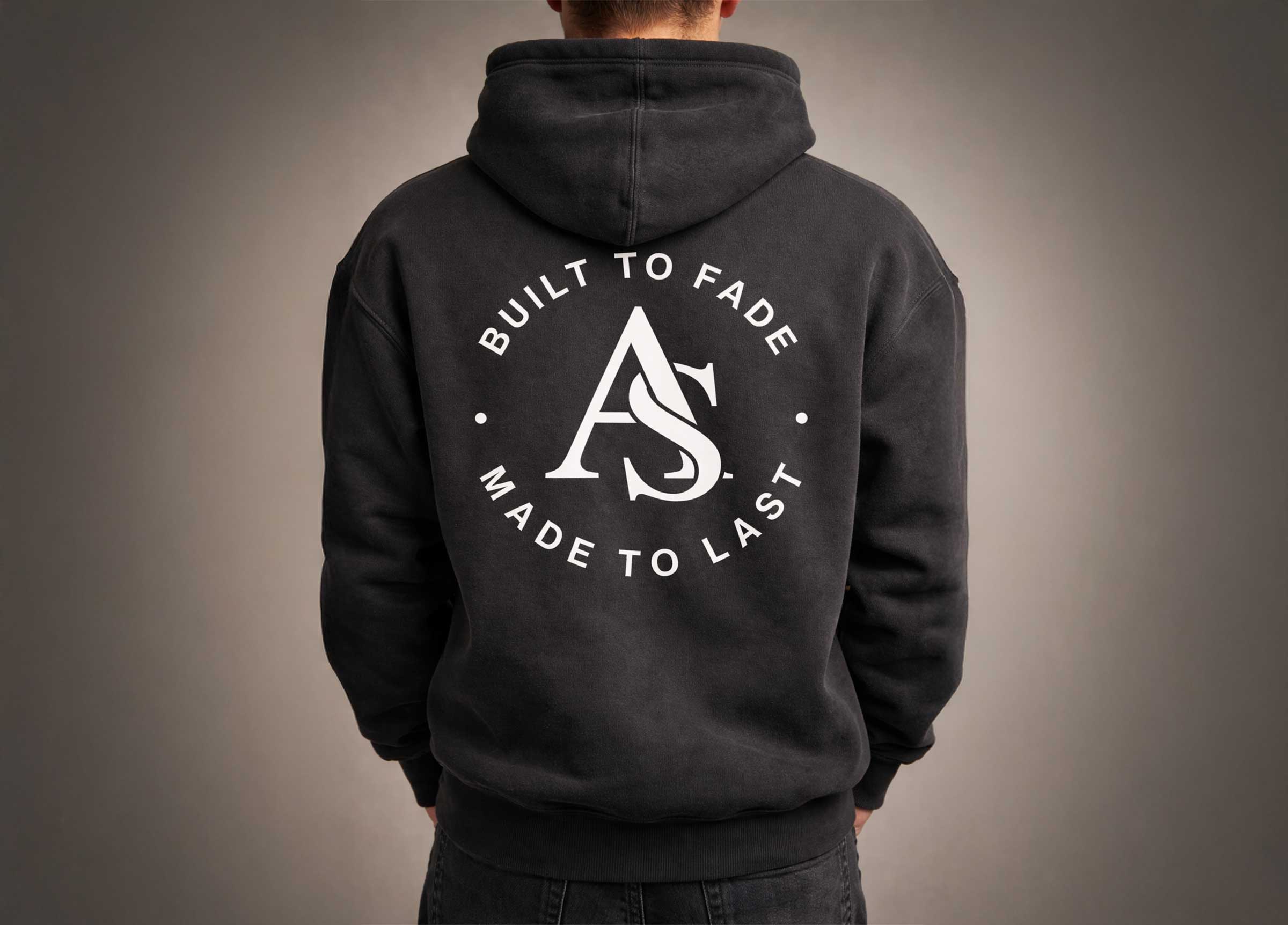
From there, we developed a monogram that could live independently of the full wordmark. The mark needed to be bold enough for storefront signage, subtle enough for apparel, and iconic enough to function as a badge of belonging.
The color system followed suit. Earth tones replaced high-contrast clichés. Warm neutrals, grounded browns, and muted hues created a palette that felt lived-in and timeless. The result was a brand that felt authentic, confident, and built to last.
The Outcome
The final identity positioned American Standard as more than a place to get a haircut. It became a lifestyle mark, something that could live on hoodies, hats, product packaging, and in digital spaces without losing its integrity.
From typography to tone, every element reinforced the same idea: this is the new standard. Not loud. Not trendy. Just intentional, refined, and built with purpose.
Scope of Work
Brand Strategy
Visual Identity
Client
American Standard
Year
2025


Defining the New Standard of Modern Barbershop Culture.